Wednesday, 3 October 2012

Carpe Diem

Here's a look at the creative process behind one of my recent illustrations along with a few mini-tutorials covering some of the techniques used to create this illustration. This illustration was created on an first-generation iPad using the vector illustration app – Inkpad.

My illustrations are usually created by a process of discovery, actions + reactions to the actions. They involve a series of tests, comparisons, and decisions – during which layers of artwork are often left unused at the end of the piece. Allow me to walk you through the concept, layout, and detail stages of this illustration (for more examples of Inkpad illustrations check out my Flickr photostream).

The Concept
The concept behind this illustration began as a play on words from the phrase "Carpe Diem" ("seize the day")... However, "Carpe Diem" can easily be said as "Carp per diem"(per diem being latin for "daily allowance"). Naturally, the visual of a carp getting his daily meal sprung to mind. So, after some research into what carp roughly looks like, I ventured into this illustration.
Double-Take
The Layout
A quick sketch was made to help establish the mood and composition of the drawing. Very basic shapes were used as the balance of the drawing was considered. Position and size are important here. The worm, being smaller and lower, is in a position of weakness. Basic color tone is also established in this stage - this scene was envisioned to be at the bottom of a warm tropical river so a warm green was selected as the overall color.
The Lighting
This style of illustration relies heavily on lighting to set mood, enhance character features, and help guide the viewer's eye throughout the illustration. All the lighting in this illustration is created by using radial gradients to create highlights and glows that give it a luminescent look. See below for a quick tutorial explaining how the radial gradients were created for this project.


For further details on creating gradients in Inkpad check out my previous tutorials (Part 1 & Part 2).

In the image below you can see how the basic lighting began with gradients. Notice the reflected lighting off the fish's head - the upper section receives the main light source while the right perimeter and bottom of the fish use subtle gradients to illustrate "bounced" light. This helps give the fish volume and gives the illusion of a 3D shape.
The Glows
Further adjustment to the colors of the radial gradients behind the characters gives a green glow. This is achieved by setting the transparent colour in the radial gradient to a bright green (again, refer to Part 2 of my gradient tutorials for more detailed explanation on how to achieve this effect).
The Details
Adding the back half of  the fish makes the illustration more dramatic. It conveys the appearance that the fish is circling the worm and checking it out. By reducing the transparency, the tail appears to be more distant and less visible – as it would appear in murky water.

The translucent detail on fins and tail were created using a series of radial gradients. See below for the construction sequence.

The specks floating in the water are semi-transparent circles overlayed with radial gradients to give them the effect of having been hit by the light. These were added to create a sense of depth in the water. They also help emphasize the illusion of bright beams of light shining through the water illuminating particles in the murky depths.
The main light source in this illustration is behind the characters. To enhance this lighting effect and further define the outline of the characters, a thin highlight line was drawn on the edges that "receive" light. See below for a close up example of this technique. These lines were created using the pen tool to carefully outline these highlights.
The first scale created began as a circle. It was easily modified by double-tapping the left-most anchor point (with the selection tool) to remove the bezier handles and turn it into a corner. Next the handles for both the top and bottom anchor point were rotated to give the scale it's specific shape. Once one scale was done it was relatively easy to duplicate, place and tweak the existing scales. A subtle gradient fill was used  to give the scales a sense of volume – and that they overlapped one another.

The final phase of the drawing involved the shape of the weeds that surround the fish and worm. I went through several iterations, trying out various shapes sizes and positioning before settling on a simplified, more transparent version that complemented the drawing.
It's always interesting to take a look at the outline mode of the final illustration. In this case after all color and values are removed the basic flow of the illustration still works. It also reminds me a lot of the paint-by-numbers paintings I used to do as a kid.

That's it for this post ... thanks for reading! As always, I look forward to feedback, comments, and questions. Let me know if you have any suggestions for Inkpad tutorials you would like me to cover.

Wednesday, 22 August 2012

Creating app icon art with iPad

I thought it would be an interesting challenge to illustrate a high-resolution app icon using the iPad. The beauty of using vector art is that the artwork can be scaled to any size without the loss of quality - this is ideal for  the high-resolution capabilities of the retina display on both the new iPad and the new MacBook Pro.


There are several apps you can use to create professional quality vector illustrations. I decided to use Inkpad as it is familiar to me, and in my opinion, very much worth the price in the App Store. Sadly though, Inkpad has not been updated in over a year. So those of you with new iPads (3rd gen) may not find the graphics to be as crisp as the Retina Display optimized apps. 

One small aside before we get into the tutorial...For those of you who are you interested in drawing apps, there has been an interesting Apple patent published recently. Could we possibly see a vector-based app produced by Apple for both Mac line and iPad line? We shall see. I hope so.


The following is the process I used to create a fictitious drawing app icon (pictured to the left). One thing to note before beginning, I've used multiples of 32 when calculating dimensions as that is a common base for building icons.
  1. Begin by creating a new square canvas (I selected 1024 x1024 pixels for this example). Set the grid spacing to 32 pixels, ensure the grid is visible, and that Snap to Grid is also on.


  2. Select the rectangle tool.
    - Set the corner radius to 96 pixels.
    - Draw a rectangle that fills the canvas.
    Note: in the final product I scaled up the corner radius to more closely resemble an app icon. In this case, this is close to the largest radius that Inkpad will allow so we will work with it for now. Your results should look something like this.


  3. If you look closely at app icons, you’ll notice a very thin one pixel line encircling each icon that serves to highlight it and to give it a subtle 3-D look. Since there is no tool in Inkpad to achieve this task (offset a path) will have to use the following workaround.
    - Copy the rectangle.
    - Create a new layer entitled “Highlight”. Rename your original layer to “Background” and lock it by clicking the lock symbol.
    - Paste the rectangle into the new “Highlight” layer.
    - Access the Fill Tool and set the fill to none.
    - Access the stroke tool and set it to 24 points. This will give you the equivalent of a 12 point stroke when we are finished.
    - Under the “Path” menu, select “Outline Stroke”.
    - Paste the rectangle originally copied at the start of this point
    - Next, select both the pasted rectangle and the newly created stroke.
    - From the “Path” menu, select the “Intersect” option. This remove any areas that are not intersected between the two shapes. You should not be left with a thin line that extends around the shape of the rounded rectangle.


  4. Next we’ll reproduce the curved reflection that appears on almost every app icon. To create this, begin by selecting the circle tool.
    - Draw a circle similar to the picture below. Fill it with a radial gradient fill and set the gradient to originate from the center of the circle. Take particular note of the gradient stops and their locations on the gradient. Note that the first and last gradient stops are set to be completely transparent.
    - Add white to the middle stop and set the transparency in the range of 20 to 30%.
    - Paste the copied rectangle once again, and select both the circle and rounded rectangle. From the “Path” menu, select the “Mask” option. This will mask the reflection to the boundary of the app icon.

  5. Create a new layer entitled “artwork”. We will use this as an artwork layer that sits between the background color and the highlight layer.
  6. On the “Artwork” layer begin to draw the components of your paintbrush. I split mine into three components: the bristles, the handle, and the ferrule (the metal component that clamps the bristles to the handle).

  7. To add detail to the bristles I used the following method.
    - Select the freehand brush.
    - Roughly sketch out the shape that you like the bristles to take.
    - Optimize the number of anchor points (generally the fewer the better as you can get smoother curves with fewer)
    - Use the selection tool to refine your sketch by selecting and moving anchor points to their desired position. Note: you can “break” the handles by placing a second finger down when you have a handle selected. This will allow you to create crisp, sharp points.

  8. Next we will use the same technique we used to create the highlights on the rectangle to create a highlight on the bristles.
    - Using the Freehand Tool, sketch out a rough highlight over one edge of the bristles similar to the picture below. Ensure it completely overlaps one side as it will be cut out by using the intersect tool.
    - copy the bristles outline
    - paste the copied bristles outline on top of your highlight.
    - select both the bristles outline and the highlight. Use the intersect tool (Path>Intersect) to cut out the highlights.

  9. Continue to add detail to your paintbrush. Using the same technique that you used to create the detail on the bristles, create woodgrain on the handle. The handle texture can be masked using the same technique we used to mask components earlier in this project.

    Note: This step may require a lot of refinements and a great deal of patience. It’s also a good idea to take a break from your work if you find you’re getting frustrated. A clear head and fresh look at your art will often help you see which direction to head in once you resume drawing.


  10. To create the background burst effect seen in some of Apple’s icons:
    - Create a new layer below the “Artwork” layer and name it “Burst”
    - Create a circle and fill it with a radial gradient with the origin at the centre of the circle.
    - Use two gradient stops and set the outer stop transparency to 0%

  11. Select the scale tool and perform a non-uniform scale on the circle (use a second finger once you begin scaling).
    - Duplicate the beam once you’re happy with it’s width (Edit>Duplicate in Place).
    - Select the rotate tool and rotate the duplicated beam.
    - Set the object’s transfer mode to “Overlay” (Shadow and Opacity>Blend Mode>Overlay).

  12. Continue duplicating and rotating beams until you are happy with the result.

  13.  The drop shadow below the brush was created in a similar fashion below the brush:
    - Create a layer below the “Artwork” layer named “Shadow”
    - Create a circle and fill it with a radial gradient (2 stops) - place the origin of the gradient at the centre of the circle
    - Set the outer stop transparency to 0%
    - Perform a non-uniform scale on the circle with the scale tool.
    - Rotate the shadow into place
    - Repeat the process with additional shadows if necessary
  14. The last step is to make sure your icon works well as a whole. Your eye should be able to quickly identify it. Remember it will be sitting beside many other icons. For example, I experimented with a brush stroke behind the brush (see below) but determined that the composition might be too busy to take in when it was scaled down. Zoom out and take a fresh look at the colors, composition.

    Here are some suggestion if you feel your icon needs tweaking:
    - bring the “Artwork” layer to the top (above all gradients, etc). this will help the artwork to pop out.
    - experiment by turning layers on and off (e.g. the “Shadow” layer)
    - Does the main object in your icon have a definite light source?
    - What about reflected light?
    - Experiment with layer transparency to de-emphasize areas


  15. That’s it. Happy icon making on the iPad. 

Sunday, 22 April 2012

Ready to Snap

I'm giving Inkpad a bit of a rest (we haven't seen an update in a long while) and have been trying out other art creation apps. I have really taken a liking to Procreate. I downloaded it when it was on sale for 99 cents and have been very impressed with the simplicity of the user interface, the speed it performs at on my original iPad, and mostly, it's fantastic brush engine.

I admit to having a fascination for nature in my art and have always appreciated well crafted wildlife art paintings. Being a Canadian, the art of Robert Bateman springs to mind immediately, however, one of my favourite wildlife artists and influences in my artwork is Terry Isaac. See some of his work here. In particular, I love how he composes his paintings and sprinkles them with magical moments of nature - most particularly light. After seeing a digital painting by JamesCuda on Flickr I was inspired to try a wildlife painting on the iPad using Procreate.

The picture in my mind's eye that I wanted to paint was one of a Grizzly catching a salmon.
I started off with a rough sketch of what I envisioned... a Grizzly standing in a river at the edge of a waterfall, salmon in mid air. The scene lit up from behind so as to light up the bear's fur.


There are plenty of wildlife reference photos on the internet, however, be careful not to directly copy any portion of a photo or artwork as it belongs to it's creator. I had no direct photo of my own to work from so I imagined the composition myself. After some further work on the piece I realized I was not entirely happy with the composition. The bear standing in profile made the painting look too flat. 


I decided to crop in on the bear and reduce the number of salmon to one making it look more like a one-on-one encounter between the two creatures. Once happy with the basic composition, I began to add detail.


After playing with the background colours and detail, I settled on a completely out of focus background to help draw the eye on the main elements in the painting.
Here is the final piece. See the larger version on Flickr.


Wednesday, 22 February 2012

"Waiting..." Creative Process

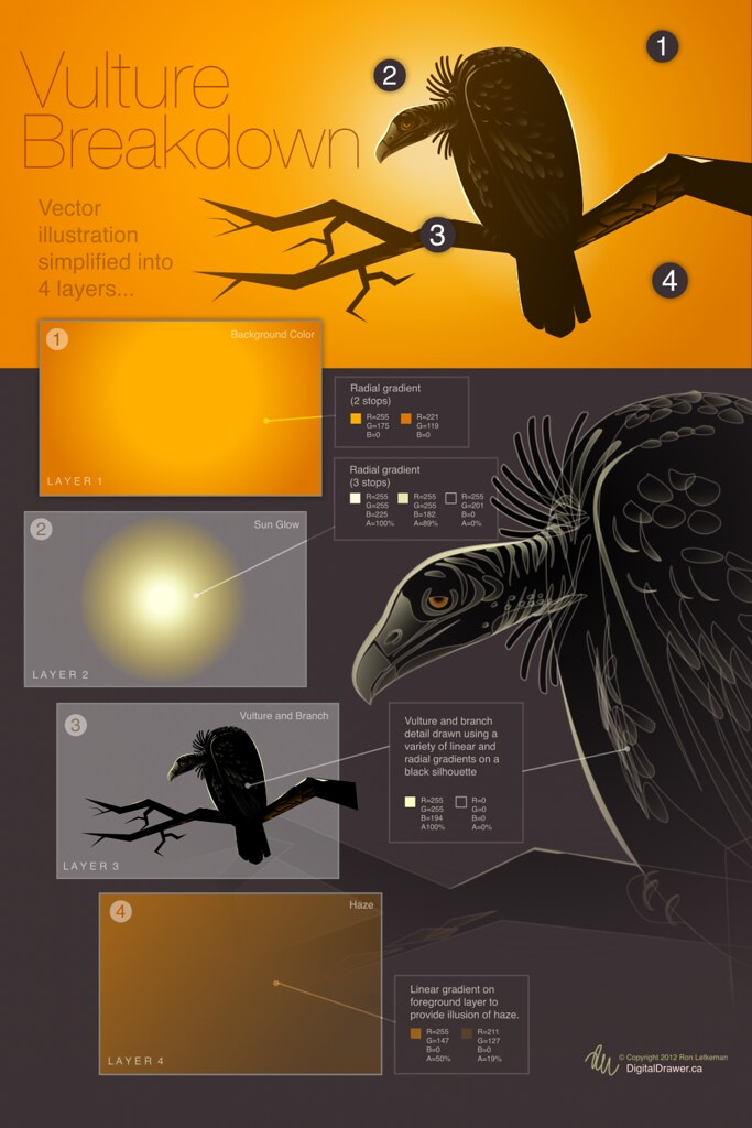
Here’s a look inside the creative process of my “Waiting...” vulture drawing.


1. I began with a rough sketch of my idea. In this case I was inspired after doing some image research on Google. As you can see by the image below, not a lot of time was spent on the rough sketch, just some simple lines and shapes to give general direction and establish composition.


2. Continuing with the rough concept, I filled in what I felt would be an effective background color along with some additional branches. My original vision was to create an image with a darker mood. 


3. The final concept began as a silhouette and one branch. After experimenting with more branches, I quickly realized that a single branch composition was stronger than multiple branches. I added a radial gradient behind the vulture to highlight the silhouette. This led to a stage of experimenting with the background color. Orange was surprisingly nice, as it gave a feeling of being in the hot African sun.


4. Next, to add a few details (feathers and highlights). Not too many though, as the main light source is behind the vulture.


5. The final step was to tweak the background sky color and add some haze overtop of the  entire piece to mute the colors and help give it a “hot and dusty” look and feel.
See graphic below for a simplified breakdown of layers and gradients used in this illustration.
Download original here (to be able to read small text)


Tuesday, 20 September 2011

Go forth and Multiply

One of my favorite new features in Inkpad 1.4 is Blend Modes (you can find them under the Shadow and Opacity menu at the bottom of the menu). Blend modes affect the way the color of an object or group is transferred onto the objects below them. By default (Normal Mode), an object is opaque and blocks any objects that may be under it. Using blend modes you can change that. For now lets focus on one particularly useful blend mode – Multiply. I find this mode to be very useful for creating shadows. In the example below I've used Multiply to created the clock shadow and the wallpaper. Notice how the shadow blends into wallpaper.

Try out different Blend Modes and take note how they react with objects. Knowing how to use them may help give your Inkpad drawings the added edge you are looking for.


Saturday, 3 September 2011

Blending Colors in Inkpad

Inkpad 1.4 is now available in the App Store. There are many fantastic new features to explore in this updated version. One of them is a powerful new color adjustment menu full of powerful ways to tweak and adjust colors you have applied to objects.

Below is an exercise to help you understand how the Blend commands work in the Color Adjustment menu. Click the figure to see larger version. See below the figure for a detailed breakdown of the instructions.


1. Draw a series of five circles horizontally
Draw a circle at the top left of your canvas. Don’t make it too large as you will be adding four additional circles to the right.
Duplicate it using Edit>Duplicate in Place. This will create a duplicate circle directly overtop the original circle.
Move the circle to the right (use graphic above as a loose guide for distance between circles).
Create three more circles by using the Edit>Duplicate and Transform Again command.

2. Duplicate the series vertically four times
Select the 5 circles.
Duplicate in place.
Move them down (using similar spacing as horizontal distance)

3. Set unique colors for the corner circles

4. Select and apply “Blend Horizontally” to the topmost row
Select all the circles in the top row.
Tap on the Color Adjustment menu and select “Blend Horizontally”

5. Select and apply “Blend Horizontally to the bottom row
Apply the same command to the bottom row

6. Select each column and apply the “Blend Vertically command
Select the column on the far left and apply Edit>Blend Vertically.
Continue the same for each of the columns.

Sunday, 21 August 2011

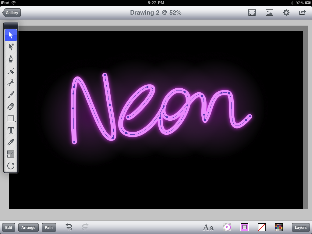
Drawing a Neon Sign in Inkpad


With the Freehand Tool or the Pen Tool begin sketching out the shape you would like your sign to take. Take time to refine your lines by adding or removing anchor points (To add, use the Add anchor point tool. To remove, select an anchor point and choose Path>Delete Anchor Points from the menu).


Set the stroke width to the desired amount. Make sure you have rounded endpoints and corners selected as this will help simulate the illusion that these are tubes.


Turn on the drop shadow using the drop shadow menu. Offset=0. Blur=33.


Using the rectangle tool from the shapes menu in the Tool Bar, draw a color background shape and send to back using Arrange>Send to Back.


Draw a circle, send it behind the neon “tubes”. Set the fill of the circle to radial gradient and apply settings similar to example pictured above. Duplicate and move the radial gradient to create the illusion of glows behind the letters.


Next, select the neon graphics. Copy and paste on a new layer.

Outline the stroke by selecting Path>Outline Stroke.


Select Copy from the Edit menu.
Draw a rectangle around the outlined shape. Send the rectangle to the back using Arrange>Send to Back. Select the outlined shape and the rectangle and subtract the outlined shape from the rectangle by applying the Path>Subtract Front command.


Add a drop shadow to the selected shape. Set Offset to 0.


Next, paste the items from your clipboard and set Fill and Stroke to none. Select all the items in the current layer (Edit>Select All in Layer)


Remember that neon lights cast light. Add soft light glows on surfaces that may be near this object.

Thursday, 4 August 2011

Marker Tutorial

This is a step-by-step tutorial for Inkpad users on how to create a drawing of a Sharpie style marker.

Marker

Begin by creating a new drawing (click the plus in upper right hand corner in the Gallery)
For this tutorial I selected Tabloid (11X17) in Landscape mode.

Next, turn on the grid and set "Snap to Grid" to on. Set the grid spacing to 0.25.


Select the pen tool and draw a shape similar to what is pictured below. This will be the body of the marker. If you need help drawing curves, check out the Pen Tool section in Inkpad help.


Next, draw the cap shape. See below for reference.


Continue to add detail like the marker tip.


Draw the cap clip.


Turn off the grid and snap to grid settings. Your drawing should look like this.


The next step is to rough in some colour. Tap on the fill menu at the bottom right of your screen and select basic colors for the marker.


Zoom in on the cap area. With the cap selected, open the fill menu and select the gradient tab. Use a linear gradient (selectable in lower left of Gradient Fill menu). Set the gradient orientation to vertical by moving the gradient control handles. Add six colour stops and space them out similar to picture below.


Next, move on to the cap clip. Similar to the cap, apply a linear gradient using similar colours to the main part of the cap. 


Quick Tip: With the cap clip selected,  sample the colour of the cap with the eyedropper tool. This will apply the gradient fro the cap. Delete the colors that are not needed and arrange as pictured below.


Move on to the body of the marker and use the same procedure as the cap - only with colors suitable for the marker body.


Next, we will add some fine detail. In the Settings menu, turn on "Snap to Points" and "Snap to Edges".


Next, we will create a highlight along the left side of the cap. With the rectangle tool, draw a rectangle along the left edge of the cap. The snap setting should allow you to do this quickly and accurately. Set the colour to a flat light blue. You might also play with the alpha (transparency) settings in the fill menu to ensure the highlight looks just the way you want.


Your drawing should now look something like this.


We will now create a small shadow from the cap onto the body. This gives the illusion that light is being cast from the cap onto the body. To do this (with your snap setting still on) draw a rectangle as shown below. Apply a gradient fill and orient the gradient control handles as shown below. Shadows can be tricky and may require a bit of patience to get looking just right. Add gradient stops and play with the transparency settings to get a subtle looking shadow.


Similar to the highlight on the cap, add one to the pen as shown below.


Shadow time. Create a circle with the circle tool and apply a radial gradient. Set the outermost color to 0% transparency.


Next squash the circle with the scale tool. With the circle selected, choose the scale tool from the tool menu. Begin dragging to scale, then add a second finger to distort the object with a non-uniform scale. It may take a bit of getting used to this, but once you master it you'll be using this technique a lot.

Quick Tip: This is a very quick way to add shadows to your objects and can be quite effective if used properly.

Send the shadow behind all objects by selecting "Send to Back" from the Arrange menu.


Now, this soft gradient shadow is nice.. but I would like to create a shadow cast from the marker. To do this, select all the components of the marker (not the shadow we just created). Copy and Paste them. They should create a duplicate copy on top of your artwork. Fill them all black.


Next, under the Path menu, select Unite.


This will create a single shape you can work with.


Using the same squash (non-uniform) scaling method we used for the soft drop shadow, scale the black shape. When you have scaled it to your satisfaction, send the object to the very back of the drawing using the Arrange > Send to Back command.
Play with the transparency settings in the Fill menu until you are satisfied with the opacity of the drop shadow.


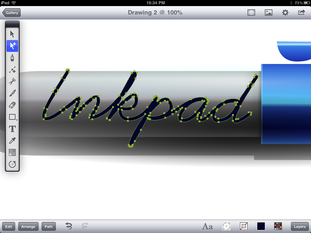
 Now on to the last of the pen details, creating a text graphic on the side of the pen. Using the freehand tool, sketch out the basic shape of the text. Set the fill of the object to None and apply a stroke.

You may need to refine the text graphic a little. Use the selection tool to move/shift the anchor points. There may be extra anchor points that need deleting. To do this select them and choose Edit > Delete. To increase or decrease text thickness adjust the stroke width value in the Stroke dialog box.


Once you are satisfied with the shape of your text graphic, select Path > Outline Stroke.


Your graphic should now be outlined like this:


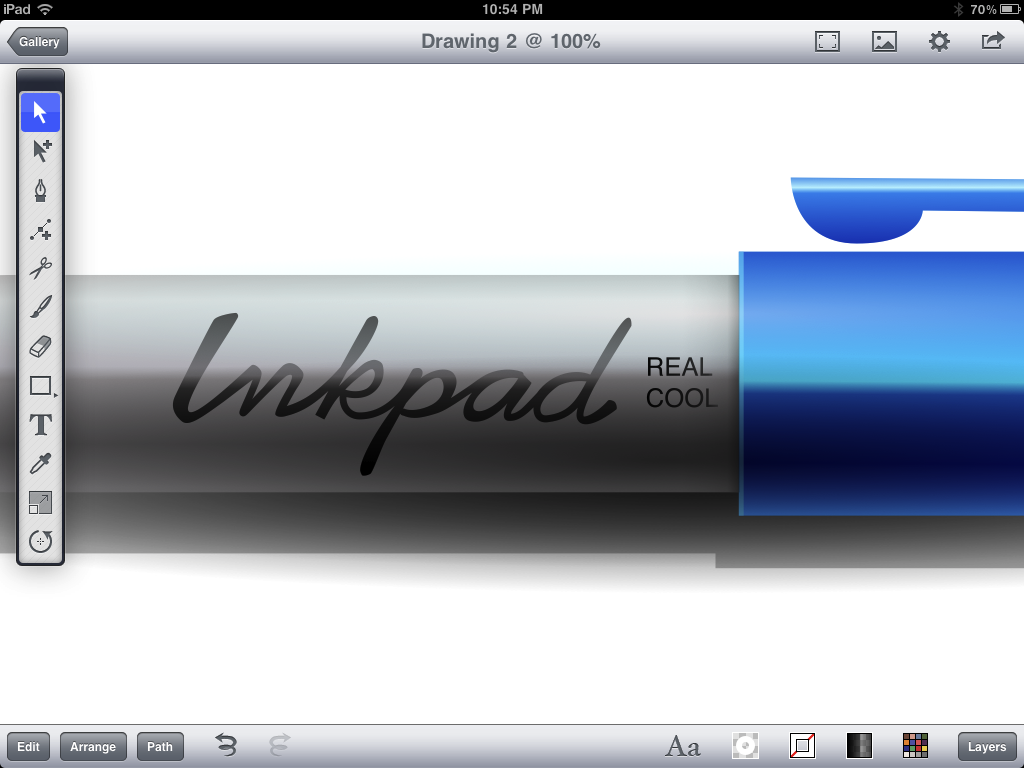
Again, take the selection tool and shift/move the anchor points to give the text graphic some character. Apply a linear gradient fill (sampled from body of the pen) and set the values similar to what is picture below.


Almost there... add any finishing details you see fit.


If you like you can add a background. In this case, I used a linear gradient to give the drawing some warmth and depth.


That's it!
Have fun using Inkpad.