Begin by creating a new drawing (click the plus in upper right hand corner in the Gallery)
For this tutorial I selected Tabloid (11X17) in Landscape mode.
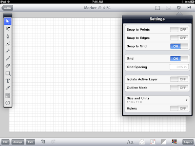
Next, turn on the grid and set "Snap to Grid" to on. Set the grid spacing to 0.25.
Select the pen tool and draw a shape similar to what is pictured below. This will be the body of the marker. If you need help drawing curves, check out the Pen Tool section in Inkpad help.
Next, draw the cap shape. See below for reference.
Continue to add detail like the marker tip.
Draw the cap clip.
Turn off the grid and snap to grid settings. Your drawing should look like this.
The next step is to rough in some colour. Tap on the fill menu at the bottom right of your screen and select basic colors for the marker.
Zoom in on the cap area. With the cap selected, open the fill menu and select the gradient tab. Use a linear gradient (selectable in lower left of Gradient Fill menu). Set the gradient orientation to vertical by moving the gradient control handles. Add six colour stops and space them out similar to picture below.
Next, move on to the cap clip. Similar to the cap, apply a linear gradient using similar colours to the main part of the cap.
Quick Tip: With the cap clip selected, sample the colour of the cap with the eyedropper tool. This will apply the gradient fro the cap. Delete the colors that are not needed and arrange as pictured below.
Move on to the body of the marker and use the same procedure as the cap - only with colors suitable for the marker body.
Next, we will add some fine detail. In the Settings menu, turn on "Snap to Points" and "Snap to Edges".
Next, we will create a highlight along the left side of the cap. With the rectangle tool, draw a rectangle along the left edge of the cap. The snap setting should allow you to do this quickly and accurately. Set the colour to a flat light blue. You might also play with the alpha (transparency) settings in the fill menu to ensure the highlight looks just the way you want.
Your drawing should now look something like this.
We will now create a small shadow from the cap onto the body. This gives the illusion that light is being cast from the cap onto the body. To do this (with your snap setting still on) draw a rectangle as shown below. Apply a gradient fill and orient the gradient control handles as shown below. Shadows can be tricky and may require a bit of patience to get looking just right. Add gradient stops and play with the transparency settings to get a subtle looking shadow.
Similar to the highlight on the cap, add one to the pen as shown below.
Shadow time. Create a circle with the circle tool and apply a radial gradient. Set the outermost color to 0% transparency.
Next squash the circle with the scale tool. With the circle selected, choose the scale tool from the tool menu. Begin dragging to scale, then add a second finger to distort the object with a non-uniform scale. It may take a bit of getting used to this, but once you master it you'll be using this technique a lot.
Quick Tip: This is a very quick way to add shadows to your objects and can be quite effective if used properly.
Send the shadow behind all objects by selecting "Send to Back" from the Arrange menu.
Next, under the Path menu, select Unite.
This will create a single shape you can work with.
Using the same squash (non-uniform) scaling method we used for the soft drop shadow, scale the black shape. When you have scaled it to your satisfaction, send the object to the very back of the drawing using the Arrange > Send to Back command.
Play with the transparency settings in the Fill menu until you are satisfied with the opacity of the drop shadow.
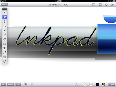
You may need to refine the text graphic a little. Use the selection tool to move/shift the anchor points. There may be extra anchor points that need deleting. To do this select them and choose Edit > Delete. To increase or decrease text thickness adjust the stroke width value in the Stroke dialog box.
Once you are satisfied with the shape of your text graphic, select Path > Outline Stroke.
Your graphic should now be outlined like this:
Again, take the selection tool and shift/move the anchor points to give the text graphic some character. Apply a linear gradient fill (sampled from body of the pen) and set the values similar to what is picture below.
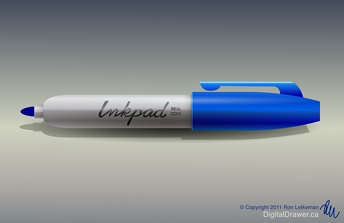
Almost there... add any finishing details you see fit.
If you like you can add a background. In this case, I used a linear gradient to give the drawing some warmth and depth.
That's it!
Have fun using Inkpad.


Thank you for sharing your knowledge & skill.
ReplyDeleteGreat tutorials. Thanks so much for them.
ReplyDeleteVicky :-)