Showing posts with label Tutorial. Show all posts

Wednesday, 28 November 2012

Illustrate a Gingerbread Man


An important technique to have in your vector illustration arsenal is flipping (or mirroring) your artwork. This is a time-saving approach is especially effective if the subject you are illustrating is symmetrical. It involves creating half of the artwork (left side or the right side) and flipping a copy to the other side saving you half of the work. Below are some instances where mirroring would work well.


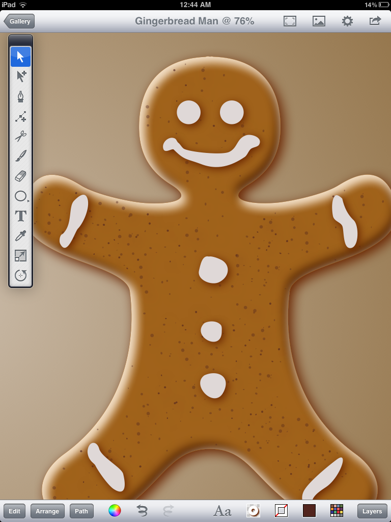
This technique was used to create the gingerbread man pictured at the top of this post.
Follow the tutorial steps below to get started.


Preparing Drawing
Open Inkpad on your iPad.
Create a new illustration. I used 8.5X11 portrait for this illustration.
Set the grid switch to "ON" under the Settings icon.
Set Snap to Grid switch to "ON".
Set your grid spacing to .25.


Creating Gingerbread Man Outline
Create a new layer called "Centerline" and draw a line down the center of the page. 
This will be used as the mirror plane. The artwork you draw on one side of this line will be reflected, or mirrored across to the other side  to create the whole illustration.
Lock the "Centerline" layer (press the lock icon in the Layers menu).

Create another new layer and name it "Outline".
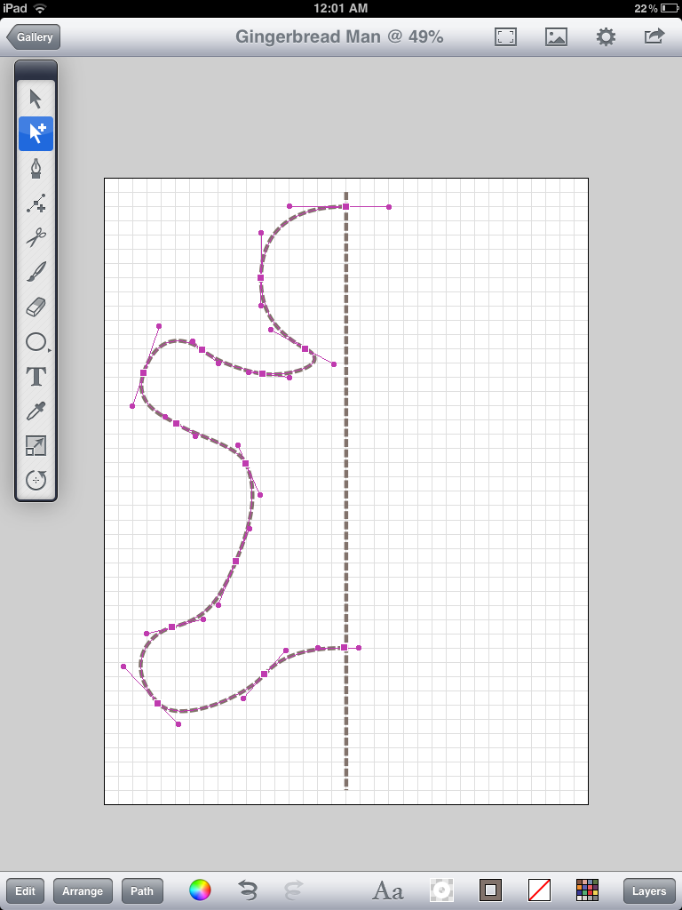
Using the bezier tool (third tool down) draw an outline similar to the image below. You may want to turn off snap to grid to do some last minute tweaks. Make sure the points on the right touch the centerline.


Duplicate the gingerbread man outline using the Edit>Duplicate in Place command.
Flip the duplicate copy of the outline using Arrange>Flip Horizontally.
Your drawing should look something like this.


Move the flipped outline to the right (hint: once you start the move, place a second finger on the screen to constrain the movement to be horizontal only).


Select both halves of the gingerbread man outlines and unite them using Path>Unite.
Note: if the centerline points were not centred over one another you may have a little cleanup to do at this point... select each stray point with the selection tool and use the Path>Delete Anchor Points command to remove them.
Hide the Centreline layer and you should now have a completely symmetrical outline of the gingerbread man.


Fill the outline with a reddish brown color:
R=180
G=98
B=27


Highlights and Shadows
The illusion of depth is created by highlights and shadows on the edge of the gingerbread man. This technique is similar to the one covered in my Curious Jelly  and Neon Sign postings.

Duplicate the ginger bread man Outline layer in the Layers Panel (Highlight layer and press the duplicate layer button located at the top right beside the plus button).

Hide the underlying outline layer.

Name the new layer "Shadow". Draw a rectangle that covers the entire outline (see example below). Send the rectangle behind the outline by using the Arrange>Send to Back command.


With the multiple selection tool (second one down) select both the gingerbread man outline and the box.
Subtract the outline from the box by using the Path>Subtract Front command.


In the Shadow and Opacity tool menu turn the Shadow switch to "ON".
Set the drop shadow angle using the wheel to set the angle.
Set the shadow offset to 4 pt and the shadow blur to 12pt
The shadow color should be a slightly darker version of the reddish brown as the shadow.
R=74
G=27
B=0


Duplicate the "Shadow" Layer and name it "Highlight".
Select the Highlight layer and change the color of the shadow to:
R=243
G=222
B=195
Rotate the shadow direction wheel to the opposite end of the wheel.


Masking
Hide the Shadow and Highlight layers in the Layer panel.
Unhide the original outline, select and copy it, and hide it again.
Unhide the Shadow layer.
Step 1 - Paste the outline into the Shadow layer.
Step 2 - Set the outline fill and stroke to none.
Step 3 - Select all the contents of the Shadow layer by using Edit>Select All in Layer
Step 4 - Mask the contents by using the Path>Mask command.

Repeat Steps 1 to 4 with the highlight layer.

After adding a shadow to the outline layer, your drawing should look similar to this:


Create a new layer to add icing details.
Sketch them in using the brush tool. Turn shadows on.

Texturing
Create another new layer below the icing details for the gingerbread man texture. Begin creating a series of small circles similar to example below. Once you have done a small section use the Edit>Duplicate command to duplicate them. Then, position them in a vacant area on the gingerbread man.


Continue doing this until you fill all areas.


When texturing is complete, select them all by using the Edit>Select All in Layer command and apply a shadow to the dots. By using a light colour it will give the illusion of being embossed into the gingerbread. Use the following color settings:
R=227
G=212
B=194
Offset = 2
Blur=3

Ensure the Shadow angle is set to a similar angle as the wheel below.


Final steps:
Duplicate the texture layer. Lock all other layers.
Select all and change the color to a lighter color (as below) 
Change shadow color to dark color.

I added some highlights on the icing using the brush tool.
These were filled with a gradient fill going from white to transparent.

Monday, 15 October 2012

Draw a Pumpkin

Autumn is here (in North America at least) and nothing symbolizes harvest time quite like a pumpkin. So, to get you in a gourd mood, here's how you can draw a nifty vector-based pumpkin on an iPad using Inkpad:


Document Setup
Open Inkpad and create a new drawing using the following settings:
Snap to points: On
Snap to Grid: On
Grid: On
Grid Spacing: .5 in
Size and Units: 8 in x 8 in


Basic Shape
Using the circle Tool, create a circle similar to the one illustrated below.
Next, with the Arrow Tool, tap on the top anchor point to select it. Begin to move the left handle upwards, while doing so place a second finger on the screen. This will "break" the handles at the control point and will allow you to control them individually. Set the handles similar to picture below.
Adjust the bottom anchor point similar to pic below. We have now drawn the basic pumpkin shape.


Stacking Shapes
Let's establish the basic pumpkin colors. First, fill the pumpkin outline with a radial gradient. Take note of the positioning of the gradient indicator.
Create 4 gradient stops and position them to the right in a similar fashion to the depiction. Exact positioning isn't important at this point as we will be tweaking later.

The colors I used (from left to right) are as follows:

Color 1
R:135  G:65  B:0

Color 2
R:255  G:153  B:0

Color 3
R:255  G:199  B:0

Color 4
R:255  G:236  B:108
Duplicate the pumpkin shape in place by using the "Edit > Duplicate in Place" command.
Select the Scale tool. Begin to scale the copied pumpkin shape. Similar to breaking the handles on an anchor point, place a second finger down during the scaling process. This activates the non-uniform scale mode and will allow you to squash the pumpkin similar to the pic below. This is a little tricky and may take a few tries and practice to get the hand of it. If you are having difficulty scaling the shape the way you want, try turning off the snap settings.


Repeat the previous copy, paste, and scale actions to create another layer of pumpkin.


Repeat again... And your pumpkin should now look like this.


Next, remove the darkest color from the gradient of the front pumpkin shape.
Select each of the shapes and adjust the position of the darkest gradient stop so that it blends in with the shape in front of it.


Select the top anchor point of the frontmost shape. With the Selection Tool selected, double-tap on the anchor point. This will convert it to a corner. Now, double-tap it again. This will return it to a smooth curve.


Adding Detail
Create a new layer below the pumpkin shapes for the stem. With the Brush Tool selected, draw a stem shape.


Use a radial gradient to set the colors of the stem.
To add further realism to the pumpkin we will add a shadow.
Copy the largest pumpkin shape and paste it into a new layer above all other layers.
Fill the layer with a radial gradient and set the transfer mode to multiply.


Set the gradient controls to have the smaller radius on top. Extend the control slightly beyond the top and bottom if the shape.
The colors used for the gradient stops are (left to right):
Color 1
R:255  G:255  B:255

Color 2
R:181  G:95  B:61

Color 3
R:78  G:44  B:0

Color 4
R:172  G:156  B:135

Notice Color 2 gives the pumpkin a much richer orange hue.

Shadows
Create a new layer above the layered pumpkin artwork.
Select the back most pumpkin shape. Copy it and paste it in your new layer.
Fill it with a centered radial gradient using colors similar to the gradient pictured below. Keep the darker colour a warm color.
Change the Blend Mode to Multiply (under Shadow and Opacity menu)


Adjust the gradient controls by bringing the center gradient control point just past the top of the pumpkin - and the outer control point just past the bottom. See example below.
For the cast shadow create another new layer. Draw a circle and fill it with a centered radial gradient. Use the following arrangement for the gradient stops. Set the transparency of the outermost gradient to 0%.


Use a non-uniform scale (two finger technique) to squash the shadow.


Place the shadow below the pumpkin and send the layer below all other layers. Adjust the location of the gradient stops until you are satisfied with the look if the shadow.
Add some details to the stem. A couple of subtle, well placed highlights help a lot.
One final step. Create a background layer below all other layers. Create a box and fill it with a linear gradient.

Wednesday, 3 October 2012

Carpe Diem

Here's a look at the creative process behind one of my recent illustrations along with a few mini-tutorials covering some of the techniques used to create this illustration. This illustration was created on an first-generation iPad using the vector illustration app – Inkpad.

My illustrations are usually created by a process of discovery, actions + reactions to the actions. They involve a series of tests, comparisons, and decisions – during which layers of artwork are often left unused at the end of the piece. Allow me to walk you through the concept, layout, and detail stages of this illustration (for more examples of Inkpad illustrations check out my Flickr photostream).

The Concept
The concept behind this illustration began as a play on words from the phrase "Carpe Diem" ("seize the day")... However, "Carpe Diem" can easily be said as "Carp per diem"(per diem being latin for "daily allowance"). Naturally, the visual of a carp getting his daily meal sprung to mind. So, after some research into what carp roughly looks like, I ventured into this illustration.
Double-Take
The Layout
A quick sketch was made to help establish the mood and composition of the drawing. Very basic shapes were used as the balance of the drawing was considered. Position and size are important here. The worm, being smaller and lower, is in a position of weakness. Basic color tone is also established in this stage - this scene was envisioned to be at the bottom of a warm tropical river so a warm green was selected as the overall color.
The Lighting
This style of illustration relies heavily on lighting to set mood, enhance character features, and help guide the viewer's eye throughout the illustration. All the lighting in this illustration is created by using radial gradients to create highlights and glows that give it a luminescent look. See below for a quick tutorial explaining how the radial gradients were created for this project.


For further details on creating gradients in Inkpad check out my previous tutorials (Part 1 & Part 2).

In the image below you can see how the basic lighting began with gradients. Notice the reflected lighting off the fish's head - the upper section receives the main light source while the right perimeter and bottom of the fish use subtle gradients to illustrate "bounced" light. This helps give the fish volume and gives the illusion of a 3D shape.
The Glows
Further adjustment to the colors of the radial gradients behind the characters gives a green glow. This is achieved by setting the transparent colour in the radial gradient to a bright green (again, refer to Part 2 of my gradient tutorials for more detailed explanation on how to achieve this effect).
The Details
Adding the back half of  the fish makes the illustration more dramatic. It conveys the appearance that the fish is circling the worm and checking it out. By reducing the transparency, the tail appears to be more distant and less visible – as it would appear in murky water.

The translucent detail on fins and tail were created using a series of radial gradients. See below for the construction sequence.

The specks floating in the water are semi-transparent circles overlayed with radial gradients to give them the effect of having been hit by the light. These were added to create a sense of depth in the water. They also help emphasize the illusion of bright beams of light shining through the water illuminating particles in the murky depths.
The main light source in this illustration is behind the characters. To enhance this lighting effect and further define the outline of the characters, a thin highlight line was drawn on the edges that "receive" light. See below for a close up example of this technique. These lines were created using the pen tool to carefully outline these highlights.
The first scale created began as a circle. It was easily modified by double-tapping the left-most anchor point (with the selection tool) to remove the bezier handles and turn it into a corner. Next the handles for both the top and bottom anchor point were rotated to give the scale it's specific shape. Once one scale was done it was relatively easy to duplicate, place and tweak the existing scales. A subtle gradient fill was used  to give the scales a sense of volume – and that they overlapped one another.

The final phase of the drawing involved the shape of the weeds that surround the fish and worm. I went through several iterations, trying out various shapes sizes and positioning before settling on a simplified, more transparent version that complemented the drawing.
It's always interesting to take a look at the outline mode of the final illustration. In this case after all color and values are removed the basic flow of the illustration still works. It also reminds me a lot of the paint-by-numbers paintings I used to do as a kid.

That's it for this post ... thanks for reading! As always, I look forward to feedback, comments, and questions. Let me know if you have any suggestions for Inkpad tutorials you would like me to cover.