Vector art lends itself very well to a graphic, flat style - flat lines, colors, shapes (Figure 1A). This may be the style of art you are trying to produce; however, here’s another option that will help bring your artwork a sense of volume. Gradients. If used properly, gradients can help your art produce a sense of 3 dimensions.
There are two types of gradients - linear (gradually changing straight lines) and radial (gradually changing circles). I will be focusing on radial gradients in this post.
You can apply a gradient in Inkpad by creating/selecting an object, tapping on the Fill button and selecting the gradient button at the top of the Fill panel. Although Inkpad is only limited to 6 color stops (color changes) that is enough to create some fantastic artwork.
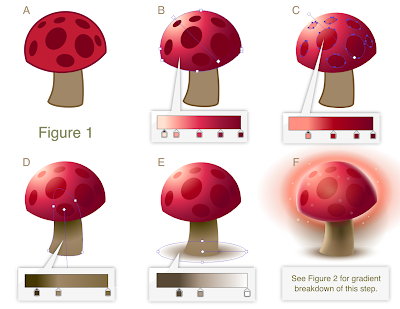
Below (Figure 1) is an illustration showing the conversion of a mushroom from a flat 2D style to a 3D look using only radial gradients. Each step shows the gradient colors used. You can also see where I’ve placed the gradient control handles to maximize the placement of the gradient
A - Original art
B - Radial gradient applied to mushroom cap
C - Radial gradient applied to mushroom cap spots - with lightest color removed to keep spots visible slight tweak to control handles. Stroke removed
D - Radial gradient applied to stem. The top of the gradient is darker shade to simulate shadow cast from the mushroom cap. Stroke removed
E - Radial gradient created to simulate drop shadow. This is one of my favorite techniques in Inkpad. To create this effect draw a circle and apply a radial gradient. Center the gradient by moving the control handle for the first color stop to the center of the circle. Next, use the scale tool to flatten the circle. This can be accomplished by performing a non-uniform scale on the circle (hold down a second finger while dragging the scale tool). By this stage the mushroom is starting to look pretty good and you might be tempted to stop here, however, there are a few additional steps you can take to make the art more zippy. You can see the steps for step F in Figure 2.
F - Cap Highlights - There are 3 radial gradients added on top of the cap as highlights. These were created by setting the gradient colors to go from the highlight color in the first stop to 100% transparent in the second stop.
Stem Highlights - 2 highlights, created in a similar manner to the cap highlights, are stacked on top of the stem. The one on the left is larger as it illustrates the light cast by the main light. The second highlight represents bounced light and helps define the right side of the stem.
Glows & Shadows - additional glows and shdows were added to the mushroom to further enhance the 3D look.
I continue to be very impressed with the features offered in Inkpad. In fact, all artwork in this post was created on iPad using Inkpad.
Stay tuned for Part 2.


Amazing tutorial for Inkpad!
ReplyDeleteYou're the king!
Amazing that InkPad can do this. I have iDraw as well but find InkPad easier to use.
ReplyDeleteThanks for the tutorial Ron!
ReplyDeleteGreat tutorial. Thanks
ReplyDeleteAwesome. I've already used some of your images for inspiration, so it's great to see this in-depth tutorial. The way you layer the gradients really makes the image pop.
ReplyDeleteKeep up the the good work. Hope to see more tutorials in the future.
Hi Ron, I really have been learning a lot from your tutorials ( I'm a novice wannabe). Thanks for sharing your great work and I hope to see more in the future. P. S. how do I fill odd shapes like the clip in the felt pen drawing? Any help would be appreciated.
ReplyDeleteCan you do a linear gradient from top to bottom rather than left to right?
ReplyDelete